How to change your website’s theme and colours
The Appearance group changes how your public website looks. Your pages, services and settings stay the same whatever you choose here: switching the theme never changes your content.
Video tutorial #
Watch The website's themes and looks on YouTube
Its tabs are Themes, Colours and mode, Typography, Layout and motion, Images and App home.
Themes #
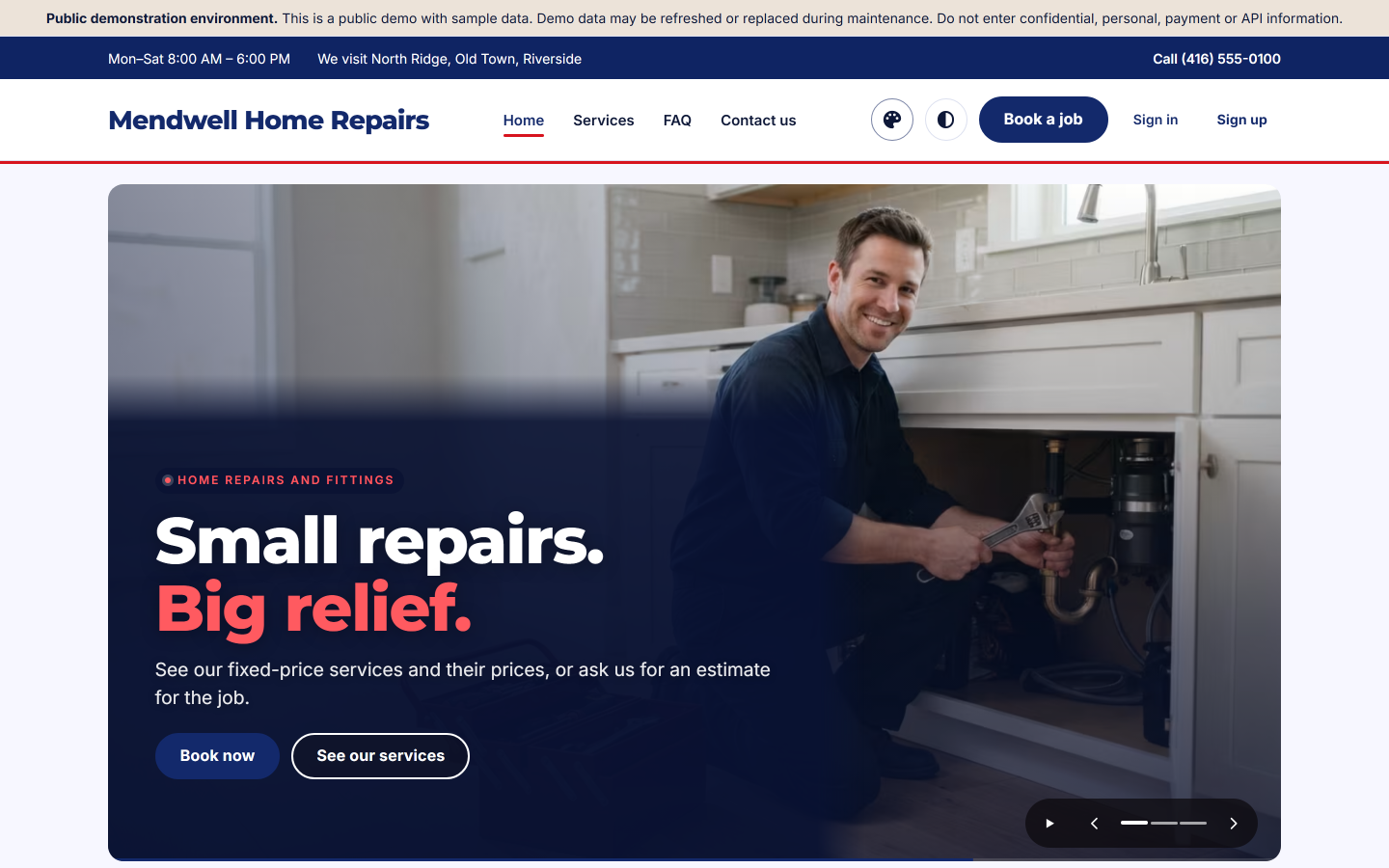
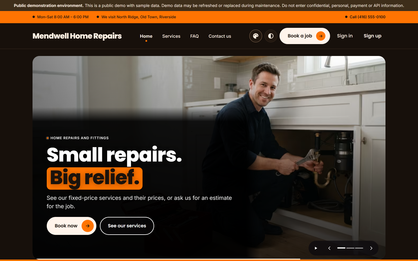
Appearance → Themes shows the three themes, each with a Light and a Dark sample, its description and its Colours chart:
| Theme | Its look |
|---|---|
| Anchor | Steady and trustworthy: navy and signal red, bold geometric headings, an angled photo edge with two stripes and one big rounded corner on every card |
| Sunrise | Warm and friendly: cream paper, a bright sunrise orange with dark text on it, bold black headings and black pill buttons |
| Coral | Calm and modern: cool greys, soft coral for the main button and the highlights, light headings and crisp square cards |
The theme in use says Current. For another theme:
- Preview opens your website in that theme for you alone. A bar at the top says that only you can see it and that visitors still see the saved appearance.
- In that bar, Activate saves exactly what you see for every visitor; Back to Appearance returns here; End the preview stops it.
Or press Activate under the theme on this page. Your brand colours, fonts, layout choices and pictures are kept when you change the theme.
Colours and mode #
Appearance → Colours and mode:
- Colour mode: Follow the visitor's device (recommended), The theme's default (Light for each of the three themes), Always Light or Always Dark.
- Show the Light/Dark switch to visitors — their choice is kept in their browser only.
- Brand colours in Light and Brand colours in Dark: a Main colour (buttons, links) and an Accent colour (small highlights), each a six-digit colour such as
#13296B. Leave a field empty to use the theme's colour.
Save colours and mode saves; Preview on the website shows it to you first. The Colour charts below list each theme's own colours in Light and Dark, what each one is for and how well text reads on it; your brand colours replace only the main and accent colours.
Typography #
Appearance → Typography: the font of the Headings and of the Text — the theme's choice, or Inter, Montserrat, Poppins, Sorts Mill Goudy or Marcellus SC — with a sample line of each. Save typography.
Layout and motion #
Appearance → Layout and motion:
- Content width: Standard or Wide.
- Page width: Boxed (on wide screens the homepage's photos stay inside the page as rounded panels) or Full width (the slideshow runs edge to edge until it would be wider than about twice its height).
- Header: scrolls away with the page, or stays at the top while visitors scroll.
- Homepage hero: Slideshow (the slides one after another, in the slideshow's style) or Side by side (the first slide's words beside its picture). Kept when you change the theme.
- Motion: Off (nothing moves), Subtle (recommended) or Cinematic. Visitors who ask their device for reduced motion see no sliding or zooming: the slideshow changes slides with a gentle cross-fade only.
Save layout and motion, or Preview on the website first.
The homepage and its slideshow #
Website → Homepage shows the homepage's sections in their order; a section without published content stays hidden. Each section is saved on its own (Save Hero slides, Save What we do, Save How it works and the others). In a slide's Heading, words between stars show in the theme's accent colour: Small repairs. *Big relief.* Add a slide adds one.
Slideshow settings (on the Homepage page) opens the slideshow's own page:
- Style: Cinematic Drift, Shutter, Big Word or Lens;
- Height: Full screen, Tall, Medium or Short (tall suits most pictures);
- Time per slide (seconds): from 3 to 10. The slideshow always plays; visitors can pause it, and the pause button and the dots are always shown;
- Transition speed, Overlay strength (the shade behind the text), Text position and Show the arrows (Previous / Next).
Each slide can have a picture for computers and tablets and another for phones (PNG, JPEG or WebP; at most 20 MB).
Note: On the homepage slideshow, the highlighted words of a slide's heading show in the accent colour on the first slide only.
Images #
Appearance → Images holds the pictures the themes use — the homepage hero (used when a slide has no picture of its own), the Recent work pictures and the others — each with its recommended shape and size. Your pictures show in every theme; leave a slot empty to use the theme's own picture. Choose a picture from the Media library or upload a new one (PNG, JPEG or WebP), give it its Alternative text (required: what it shows, for people who cannot see it) and its Focal point for wide screens and for phones, so that a face is never cut off.
App home #
Appearance → App home sets the home screen of your business's app: the tiles your customers tap (Book a job and the others; each shown or not, its place and its icon), the icon on each category's photo and an offers banner. The app shows your website's theme in Light and Dark.
Who can change the appearance #
The owner. Brand, business details and the legal pages are under Website (Brand, Business profile, Legal pages).